Interactive Elementary Learning CenterWEBSITE DESIGN・DESKTOP・MOBILE

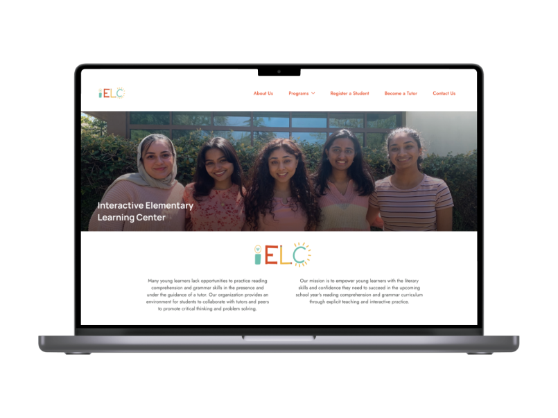
INTRODUCTIONMy team created a user-friendly website for the Interactive Elementary Learning Center (IELC), a new non-profit organization dedicated to providing free summer tutoring for students in grades 1-5 in Davis and Sacramento. We created a mobile and online platform where all student and tutor registrations are handled directly on our website.
MY ROLEI was responsible for user research and analysis, brand development, creating design systems visual identity, and product design.
TIMELINEFebruary — March 2023;
Launch in April 2023
Launch in April 2023
TOOLSFigma, Slite, Notion

PROBLEM STATEMENTIELC is a brand-new tutoring company aiming to improve access to free summer tutoring for elementary students. However, they lacked a platform to streamline student and tutor sign and showcase their services. To tackle this, I created a problem statement:
"How can we design a website that establishes credibility, reliability, professionalism, while also serving as the primary application platform?"
Let's break it down!
"How can we design a website that establishes credibility, reliability, professionalism, while also serving as the primary application platform?"
Let's break it down!
BREAKDOWN OF THE CHALLENGE
Building Brand Identity from Scratch 🌱I need to build a brand identity from scratch, despite limited resources and the lack of existing brand imagery and testimonials.
Mission and Goals 🚀I want to ensure that the project aligns with and highlights the core mission and goals of the company.
Credibility and Professionalism 💼I must create a platform that establishes credibility and professionalism for the organization.
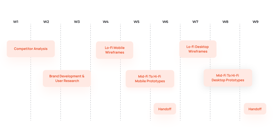
PROJECTED TIMELINEPlanning for SuccessBefore diving into research or mockups, I first created an outline for each design stage I would follow. I've learned that mapping out a timeline is crucial for achieving all my goals within a specific timeframe. The site needed to be fully developed in under 8 weeks.

DESIGN PROCESSDesigning All Starts with a BlueprintI've also learned that an essential step before designing is to outline my design process. Breaking down each stage helps to strengthen my workflow an ensure a thorough approach.

STAGE 1 - USER RESEARCHUnderstanding my AudienceI started the project by diving into research, conducting a competitive analysis, creating user personas, an information architecture, and mapping out task flows. This active engagement helped me empathize with our client and potential users.

For the analysis, I decided to explore other tutoring and summer camp websites targeting a similar audience. My main research areas were: what makes the company uniquely valuable, and aspects where their website excelled or not.
Some strengths of these websites including strong branding, building trust with testimonials, and effective information chunking to engage the audience without overwhelming them. I planned to ensure our site incorporated these elements.
DEEP DIVE ON POTENTIAL USERSTailoring to User Desires & AnticipationsIn this stage, I have learned the importance of empathizing with my users. Focusing on two primary user groups— prospective tutors and parents seeking tutoring for their children— I gained insights into their needs. Both groups prioritize clarity and straightforward language, preferring well-organized information and ample white space to build trust in my company and website. This understanding shaped my design decisions to meet their needs.


MAPPING THE SITEUnderstanding User Flows for OptimizationBuilding an information architecture and task flow helped me focus on key pages that address user questions. It also guided me in placing CTA buttons strategically for smooth transitions to more information. Analyzing task flows emphasized the importance or understanding user needs and ensuring the site's effectiveness. It reinforced the significance of user-centric design for seamless navigation.


STAGE 2 - BRAND DEVELOPMENTCreating a Brand Identity from ScratchAfter analyzing competitors, it was evident that a strong brand identity is crucial for each website's credibility. Therefore, I aimed to strike a balance by using colorful and inviting images to create an identity that revolves around education without veering too close to being child-like.


LOGO ITERATIONPerfecting Visual Identity IterativelyWhen creating the brand identity, I refined over 15 logo options until finding the perfect match, keeping the client updated throughout the process.
I also crafted mood boards anad implemented a cohesive design system encompassing colors, fonts, and more.
Prioritizing accessibility, I ensured our design was easily comprehensible, meeting the needs of our users who prefer clear language, easily readable text, and colors that are easy on the eyes.

DESIGN SYSTEM AND LIBRARIESDeveloping a Unified and Unique Design System


STAGE 3 - TESTING & IMPROVEMENTS3 Major Improvements to my Design and what I've LearnedThis homepage serves as a prime example of my iterative approach across every page of the project. Through continuous testing and refinement, I've come to appreciate the importance of iteration in creating a user-focused design.
Every little tweak, whether it's based on peer feedback, my own analysis, or A/B testing, has played a vital role in making the user experience better and more engaging.
Every little tweak, whether it's based on peer feedback, my own analysis, or A/B testing, has played a vital role in making the user experience better and more engaging.
INITIAL HOMEPAGE PROTOTYPE
INITIAL HOMEPAGE PROTOTYPE

FINAL HOMEPAGE PROTOTYPE
FINAL HOMEPAGE PROTOTYPE

STAGE 4 - FINAL PROTOTYPERevealing the Final Design
PRODUCT RESULTSFrom Vision to Victory: Record Growth of Users & ApplicationsAs we approach the end of the design journey, it's time to look back and see how well the product has met its goals. The website and brand identity for IELC have been a hit, with a noticeable increase in applications since its launch.
In just the first month, we received 42 applications— an impressive 320% increase! Now, the site serves as a go-to application portal, seamlessly bringing together all previous platforms. This not only boosted applications and engagement but also solidified the company's reputation for reliability and trustworthiness.
In just the first month, we received 42 applications— an impressive 320% increase! Now, the site serves as a go-to application portal, seamlessly bringing together all previous platforms. This not only boosted applications and engagement but also solidified the company's reputation for reliability and trustworthiness.

PROJECT TAKEAWAYSLessons Learned and Insights GainedLooking back on this project, I've realized just how crucial it is to adapt and customize my product to fit both my client's needs and the expectations of our users. By putting functionality first and creating a strong brand identity, I was able to find success in the business world.
Along the way, I also learned a lot about the iterative process of design and how important it is to keep refining and improving.
Overall, this experience has given me a deeper understanding of how every design element plays a role in shaping the final outcome of a project.
Along the way, I also learned a lot about the iterative process of design and how important it is to keep refining and improving.
Overall, this experience has given me a deeper understanding of how every design element plays a role in shaping the final outcome of a project.
FURTHER CONSIDERATIONSFuture Endeavors: Paths ForwardAs I look ahead, I'm eager to explore some exciting enhancements for the site. To start, I'll prioritize improving accessibility features to ensure every visitor can easily navigate and use the platform. One example would be incorporating a dark mode for the site to cater to varying needs and preferences.
Additionally, I plan to amplify the voices of parents whose children have benefited from the program by sharing their real-life stories. These updates are all about ensuring the site continues to evolve and meet the needs of our users, solidifying our company's reputation as a reliable resource.
Additionally, I plan to amplify the voices of parents whose children have benefited from the program by sharing their real-life stories. These updates are all about ensuring the site continues to evolve and meet the needs of our users, solidifying our company's reputation as a reliable resource.
This project is extra special to me because it's my first time working with a real client. Thank you for joining me on this design journey! :) Please contact me at celestechanglu@gmail.com if you have any questions or would love to learn more!