Google Developer Student ClubsWEBSITE DESIGN・DESKTOP・MOBILE

INTRODUCTIONAs the Vice President and Design Director of the Google Developer Student Club (GDSC), I undertook the challenge of redesigning our club's website. With our chapter being one of the most well-known in the Google community, it was essential that our new website not only adhered to Google's brand guidelines but also effectively represented our club's identity and mission.
The project was driven by a tight deadline of less than two weeks before the winter quarter began and the formation of our cohort project teams. One of these teams, composed of four developers, was assigned the task of programming the new site. My responsibility was to deliver a fully designed website ready for them to implement.
MY ROLEI served as the senior product designer, overseeing user research, design systems, visual assets, and collaborating with a team of 4 developers.
TIMELINEJanuary 2024 - 3 weeks;
Launch in May 2024
Launch in May 2024
TOOLSFigma, Slack,
Notion, Firebase
Notion, Firebase

PROBLEM STATEMENTI started with identifying several problems with the current website. I focused on these key questions and areas, and created a "How might we" statement to guide the redesign process.
Clarity of Purpose 🔍Does the site clearly explain what our club does? Are options such as joining, attending events, and accessing resources easy to find?
Ease of Navigation 🧭Could users easily find what they needed? Was the navigation intuitive and user-friendly?
Visual Consistency 🎨Does the website adhere to Google's brand guidelines? Does it visually represent the professionalism and dynamism of our club?
HOW MIGHT WE STATEMENT
“How can I design a user-friendly GDSC website that clearly communicates our club’s offerings, makes it easy to join and attend events, and answers common questions to reduce repetitive inquiries to our leadership team?"
STAGE 1 - USER RESEARCHGathering User FeedbackTo better understand my audience, I interviewed over 25 people, including regular club members, leadership team members, and those who don't know about GDSC. I asked them what features the website was missing and what problems they had. I learned that the website lacked informative features, leaving users guessing. Here is some of the feedback I received:
“I would like a "Contact Us" page where I can ask further questions. I would also like a place where I could potentially sign up and become a part of the club's cohort program.”
“I think a cohort page would be great. I currently don’t know what cohorts the club offers and where to get more information about them.”
“The web design looks very outdated and none of the buttons are consistent or eye-catching. The overall UI and UX can be improved.”
Noting Common Pain Points
STAGE 2 - INFORMATION ARCHITECTURESetting Up the Ground WorkAfter reviewing the user survey feedback, it was clear that the site lacked vital informational pages. To address these issues, I decided to create a sitemap to identify what content matters most to my audience and what pages need to be added. Mapping out the site not only helps prioritize important pages but also allows me to empathize with my audience and tailor the website to their needs.

STAGE 3 - UX SUGGESTIONS & THE REDESIGNReady, Set, RedesignNow that I had a better grasp of my audience and their needs, I felt ready to analyze the website and identify areas for redesign. Time to put on my design glasses and get started!
WEBPAGE 1 - HOMEPAGE (BEFORE)


WEBPAGE 1 - HOMEPAGE (REDESIGNED)Evaluating the User Experience
User-Centered Solutions
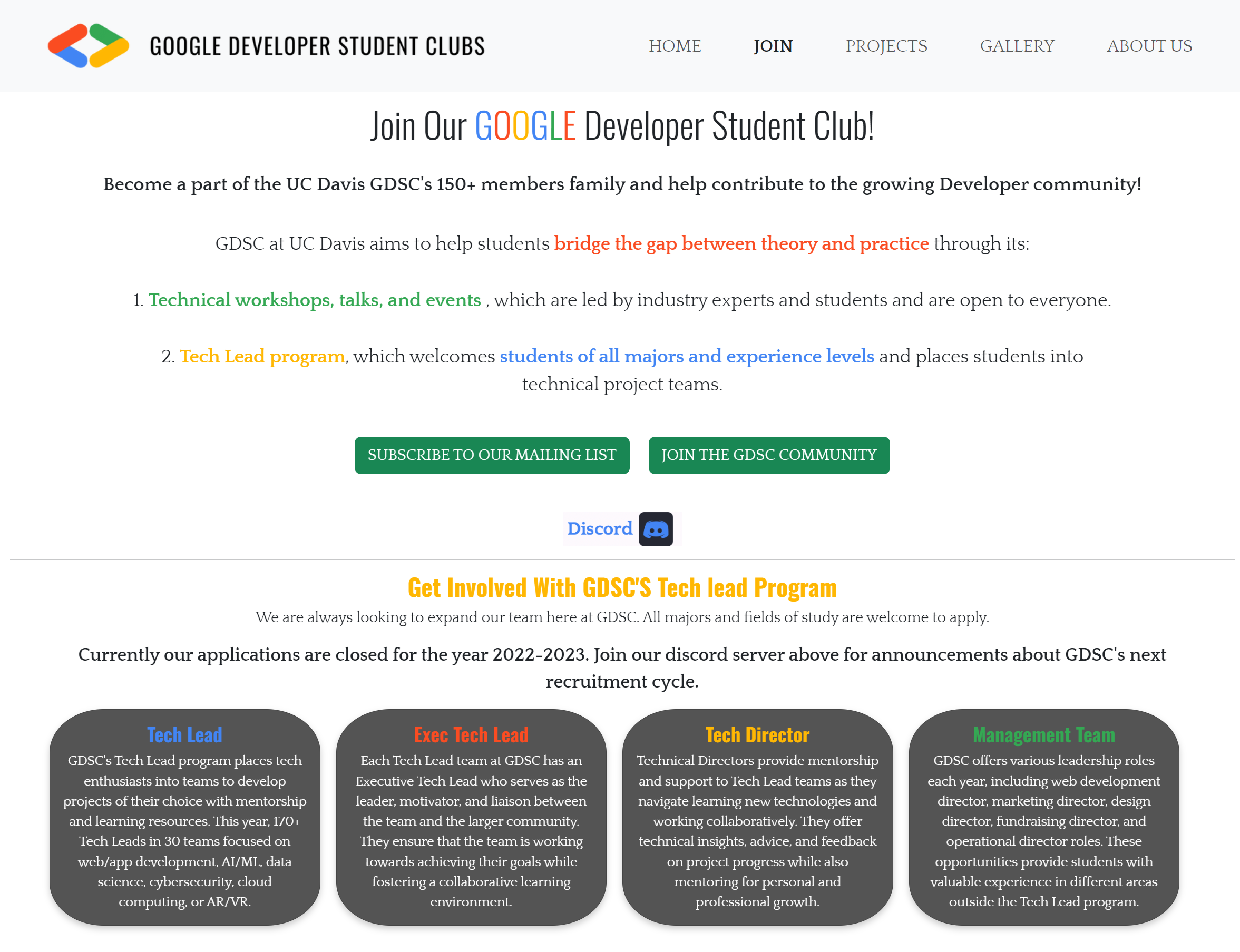
WEBPAGE 2 - JOIN (BEFORE)Information OverloadThe next page under review was the “Join” page, which had proven to be somewhat misleading. It provided information about both the club and a tech lead program. To improve clarity, I recommended renaming it and dividing it into two separate pages: “About Us” and “Apply.” This segmentation will help users find the information they need more easily. Shall we analyze this page together now?


WEBPAGE 2 - ABOUT US & APPLY (REDESIGNED)More Pages for Better Organization
Research-Based Improvements
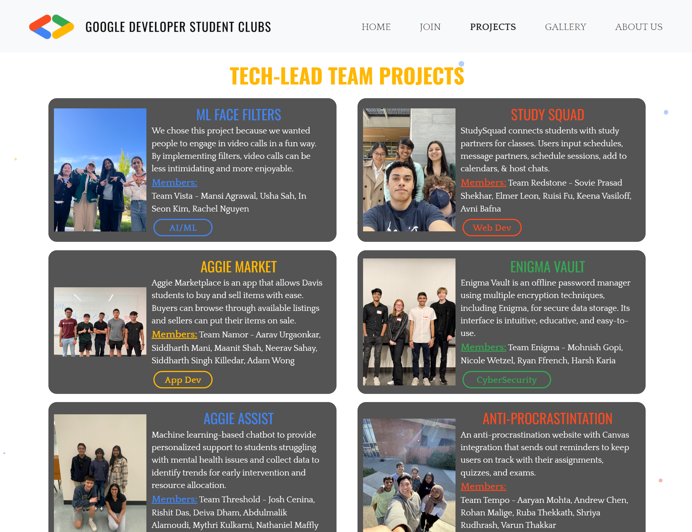
WEBPAGE 3 - PROJECTS (BEFORE)Endless Scrolling


WEBPAGE 3 - PROJECTS (REDESIGNED)Fixing Overflow with Horizontal Scrolling
Project Page Enhancements
OTHER WEBPAGES & MOBILE DESIGNBuilding Essential WebpagesFrom my user research and surveys, I learned that my audience needed more informational pages. It's important to listen to audience feedback and create pages that meet their needs. While redesigning existing pages is crucial for improving the website, adding necessary new pages is also important. Additionally, I built the mobile version of the site from scratch to ensure it is accessible on all devices. Take a closer look at the brand new pages and mobile version!
Mobile Design Decisions
ITERATIONSBehind the ScenesNow that I've shared my page analyses and the final product, it's important to highlight the trials and errors along the way. Here’s my secret recipe for successful designs: Research. Sketch. Design. Research. Revise. Repeat. It's a repetitive process, but it's key to achieving great results.
Here’s a sneak peek into my iterative design process!
Here’s a sneak peek into my iterative design process!
INITIAL DESIGN

SECOND DESIGN

THIRD DESIGN

FINAL DESIGN

First Few Iterations
Finished Design
REFLECTIONDesign Journey TakeawaysInitially, I felt anxious about redesigning our club's website in just two weeks by myself. The tight timeline was challenging, but I was motivated to create something meaningful for my club and community. As Vice President and Design Director, I was committed to showcasing everything our club offers. This dedication guided me throughout the process. Drawing on my past design experiences, I focused on what I excel at: design.
Throughout this process, I've learned that design is a journey. Each small step is essential to reaching larger goals. Ongoing learning allows me to create better designs for users. I stayed focused on my end goal: crafting meaningful and useful designs. Every detail, from buttons to font sizes, is tailored to the audience—it's all about user-focused design. I've learned to identify what works and what doesn't, and the best part is that the learning is continuous.
Throughout this process, I've learned that design is a journey. Each small step is essential to reaching larger goals. Ongoing learning allows me to create better designs for users. I stayed focused on my end goal: crafting meaningful and useful designs. Every detail, from buttons to font sizes, is tailored to the audience—it's all about user-focused design. I've learned to identify what works and what doesn't, and the best part is that the learning is continuous.
That’s a wrap! Thank you so much for joining me. I had a great time designing this website, and I hope you enjoyed reading about it! Feel free to contact me at celestechanglu@gmail.com if you have any questions or would love to learn more!


